
Branding case · Visual identity · Sushi delivery
Nakama Sushi Delivery
Visual identity and brand applications for Nakama, a sushi delivery service in Isla Margarita.
Client:Nakama Sushi Delivery
Full identity Graphic pattern Packaging + stationery
Identity · 2021
Isla Margarita · Venezuela
The project
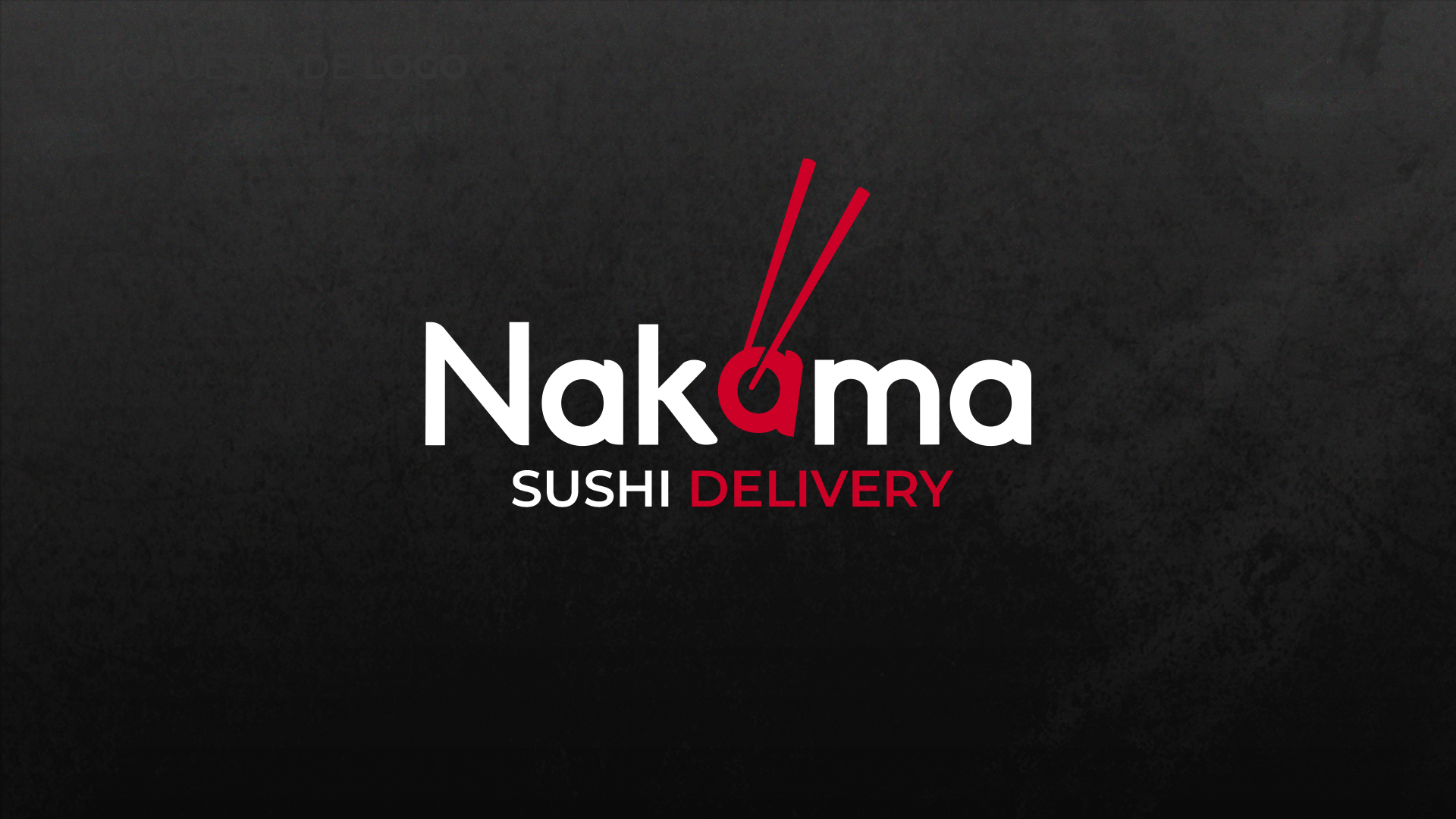
We designed the identity for Nakama Sushi Delivery, a sushi home-delivery service in Isla Margarita. The logotype turns the central `a` into a sushi piece held by chopsticks, producing an icon reusable as a seal and pattern. The palette — intense red, black and white — reinforces the sushi visual code and was applied to packaging, stationery and social pieces.
What we did
- Primary logotype with the `a` turned into a sushi piece held by chopsticks
- Color versions on white, black and brand red
- Repeating graphic pattern derived from the icon
- Applications on kraft paper bags and table stationery
Deliverables
- — Logo family and standalone icon
- — Graphic pattern in positive and negative
- — Packaging and stationery mockups
Brand system
Palette · Logo · Versions
Nakama RedNakama Red
#D8152C
RGB 216 · 21 · 44CMYK 10 · 100 · 90 · 2
Ink BlackInk Black
#111111
RGB 17 · 17 · 17CMYK 0 · 0 · 0 · 95
Paper WhitePaper White
#FFFFFF
RGB 255 · 255 · 255CMYK 0 · 0 · 0 · 0
Positive · White

Negative · Red
Negative · Ink
Positive · Paper
Project gallery
I want something like this
WhatsAppReady to grow without the headache?
Tell us your goal and we'll recommend the next step — no strings attached.