
Branding case · Logo + brand usage · Fit desserts
Oh Nene! by Jerez
Logo and brand usage for Oh Nene!, the fit-desserts shop from Margarita.
Client:Oh Nene! by Jerez
Logo + brand usage Per-flavor stickers Live online catalog
Identity · 2024
Isla Margarita · Venezuela
The project
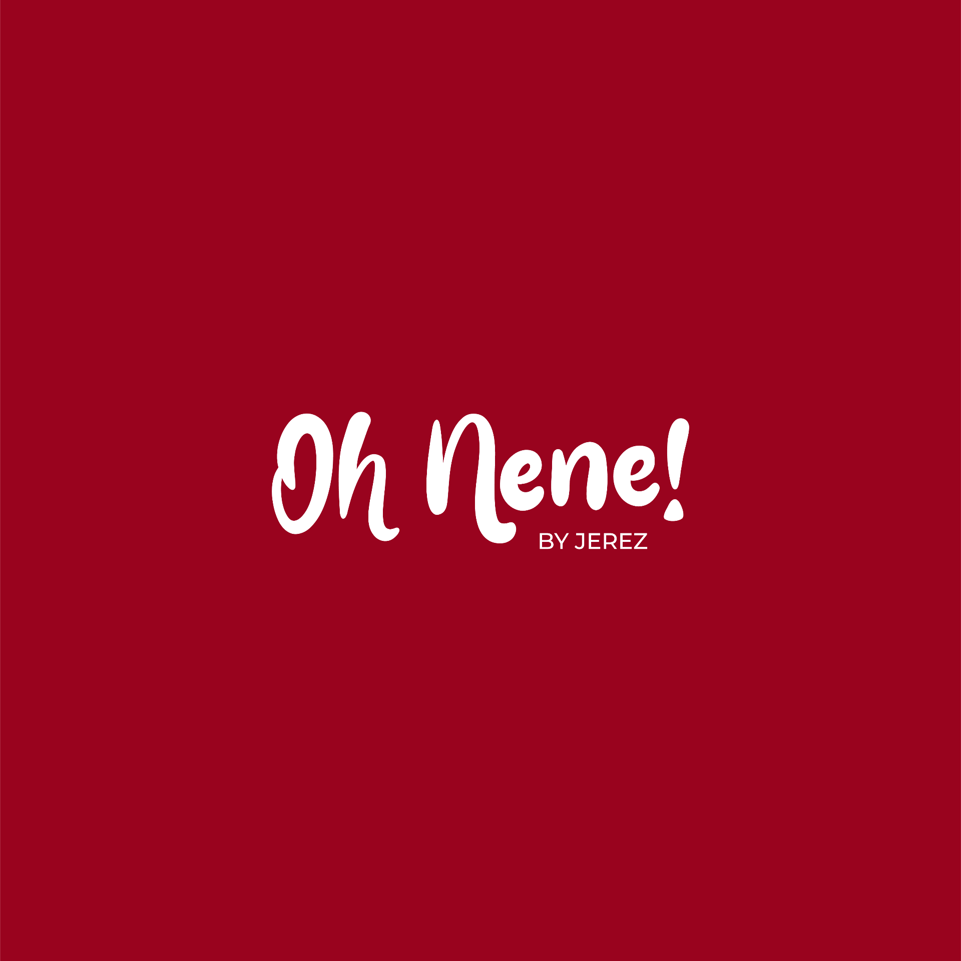
We designed the Oh Nene! by Jerez logotype and set the rules for using it across the brand's core colors. A round, friendly handwritten lettering, with the `Oh` ligature reserved for large-format pieces (stickers, packaging) and a `BY JEREZ` endorsement that keeps the chef's signature on every touchpoint.
What we did
- Primary logotype with handwritten lettering and `By Jerez` endorsement
- Color variants on the brand's red, white, orange and blue
- `Oh` mark usage rules for stickers and per-flavor packaging
- Online catalog linked from the site to showcase the full menu
Deliverables
- — Logo family in four color versions
- — Minimal brand usage guide and applications
- — Per-flavor die-cut sticker artwork
Brand system
Palette · Logo · Versions
Cherry RedCherry Red
#A60B1D
RGB 166 · 11 · 29CMYK 20 · 100 · 95 · 13
Sunny OrangeSunny Orange
#F39323
RGB 243 · 147 · 35CMYK 1 · 49 · 92 · 0
Deep TealDeep Teal
#11525C
RGB 17 · 82 · 92CMYK 85 · 47 · 50 · 35
Negative · Cherry
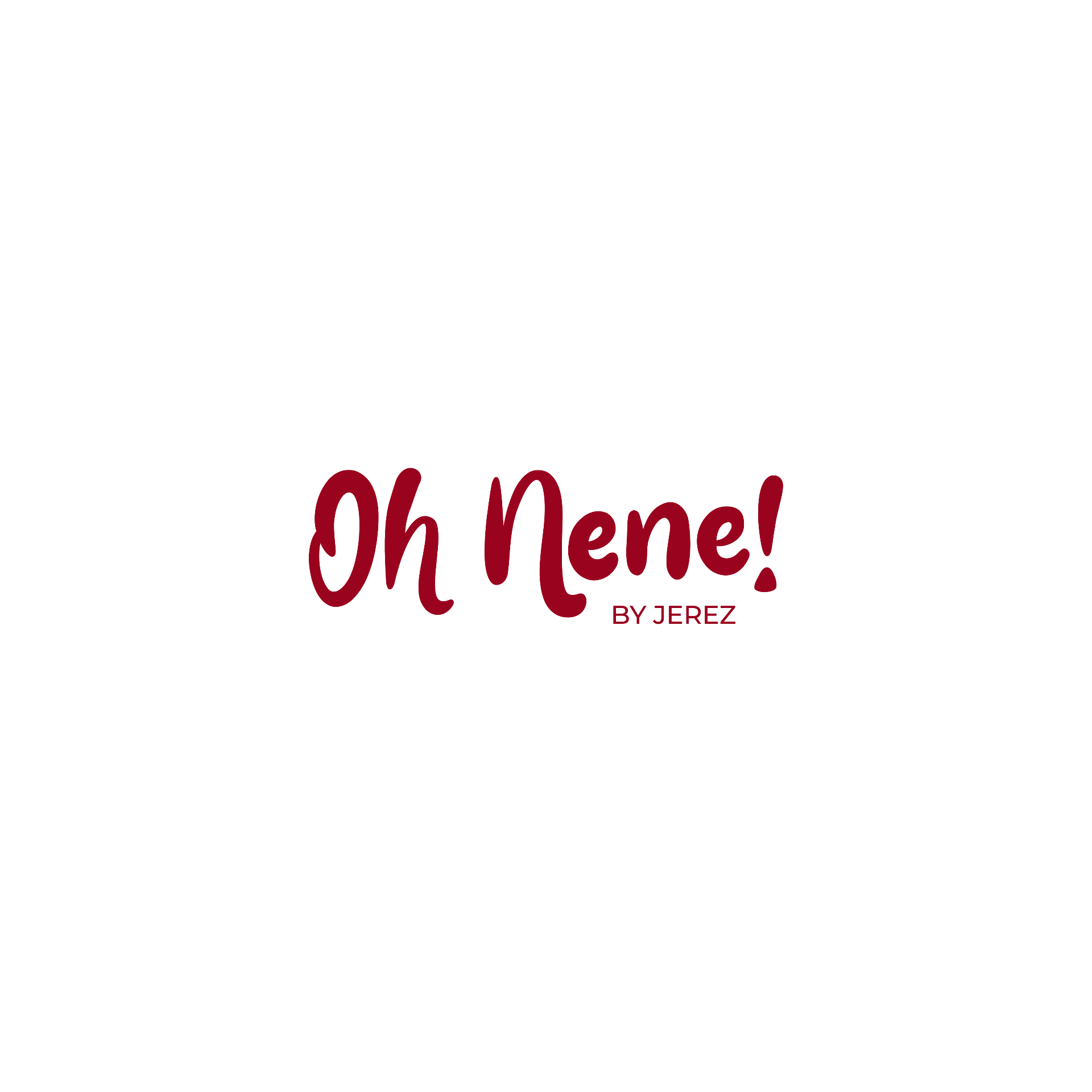
Positive · Cherry
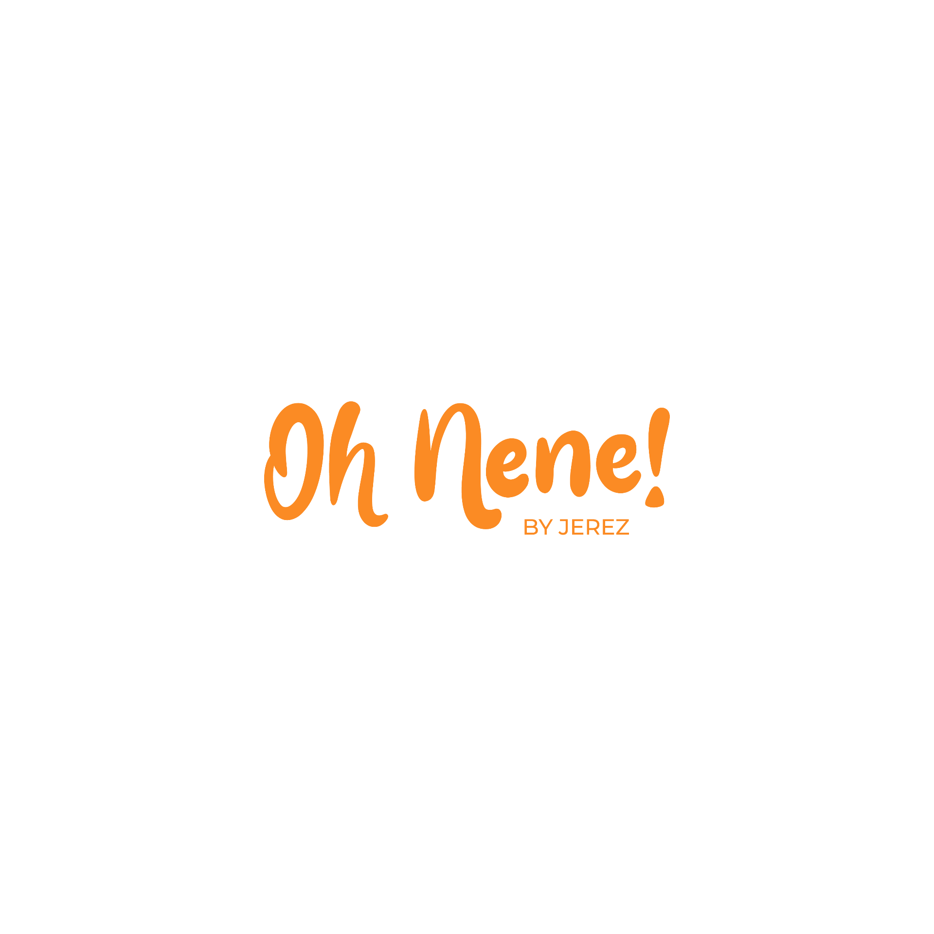
Positive · Orange
Positive · Teal
Project gallery
I want something like this
WhatsAppReady to grow without the headache?
Tell us your goal and we'll recommend the next step — no strings attached.